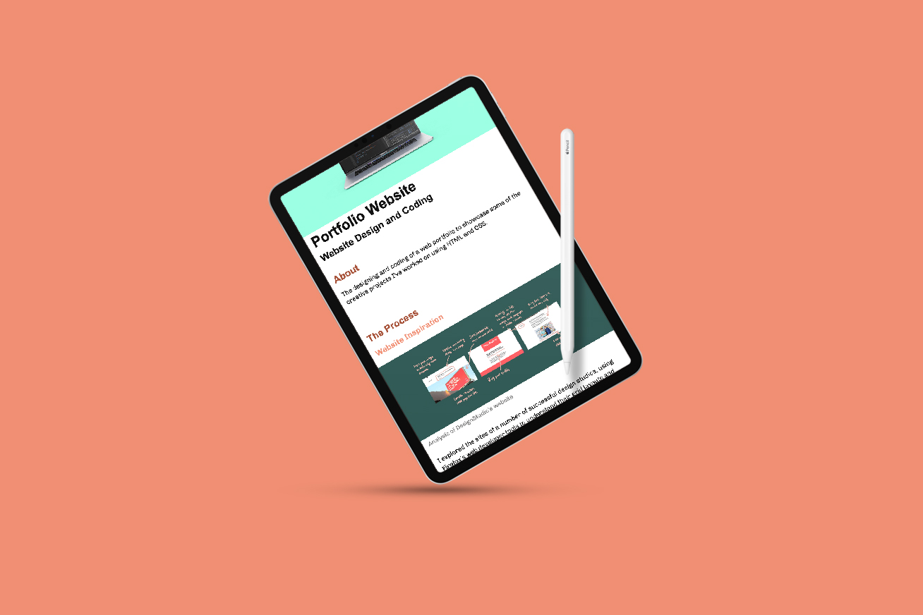
Portfolio Website
The designing and coding of a web portfolio to showcase some of the creative projects I’ve worked on using HTML and CSS.
Website Inspiration
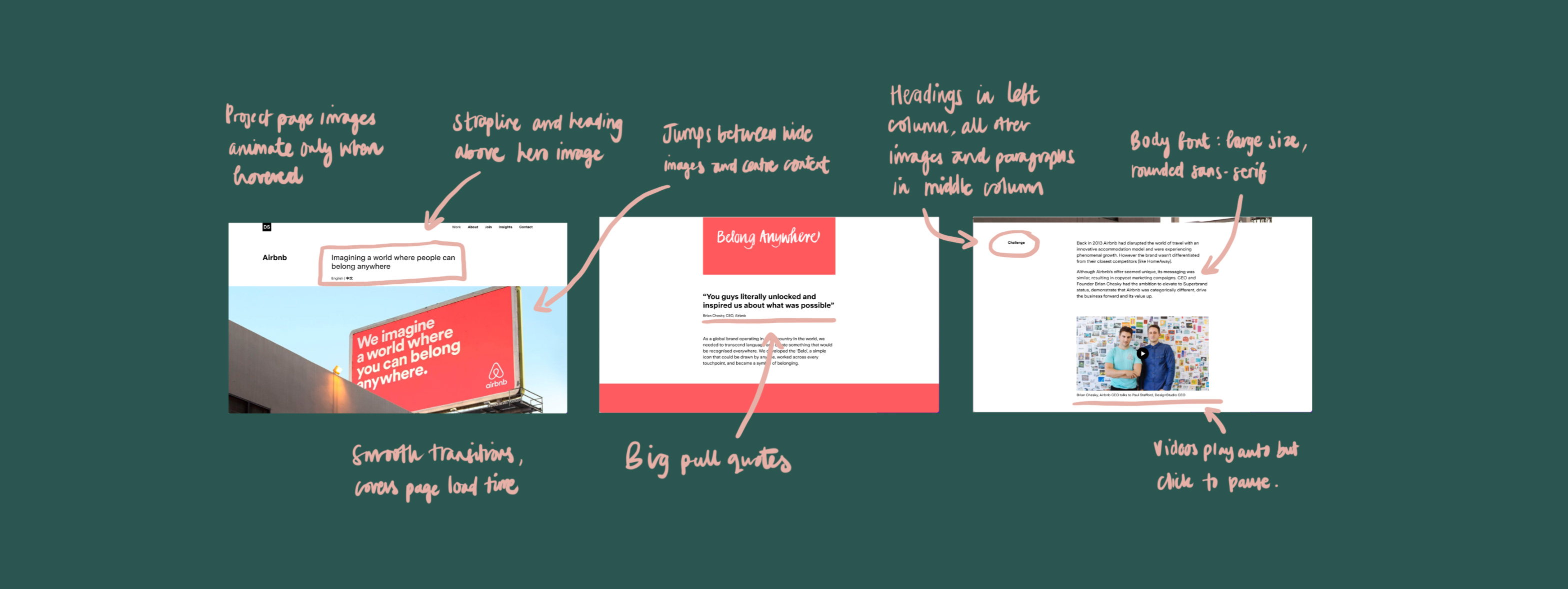
I explored the sites of a number of successful design studios, using Firefox’s web developer tools to understand their grid layouts and navigation tools. I also compared design elements such as their body font size versus line length and use of colour to inform my own decisions. Below is the analysis for a site I was particularly inspired by.
Structure
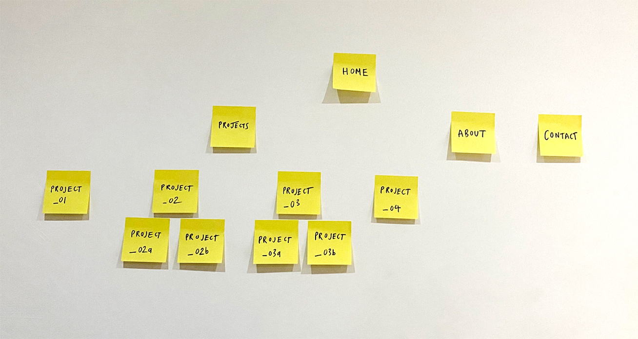
When exploring the websites, I mapped out their layouts. This helped me understand the different levels of links and the navigation within this type of website. In response, I created a post-it note layout plan for my website to begin visualising the structure.
Content
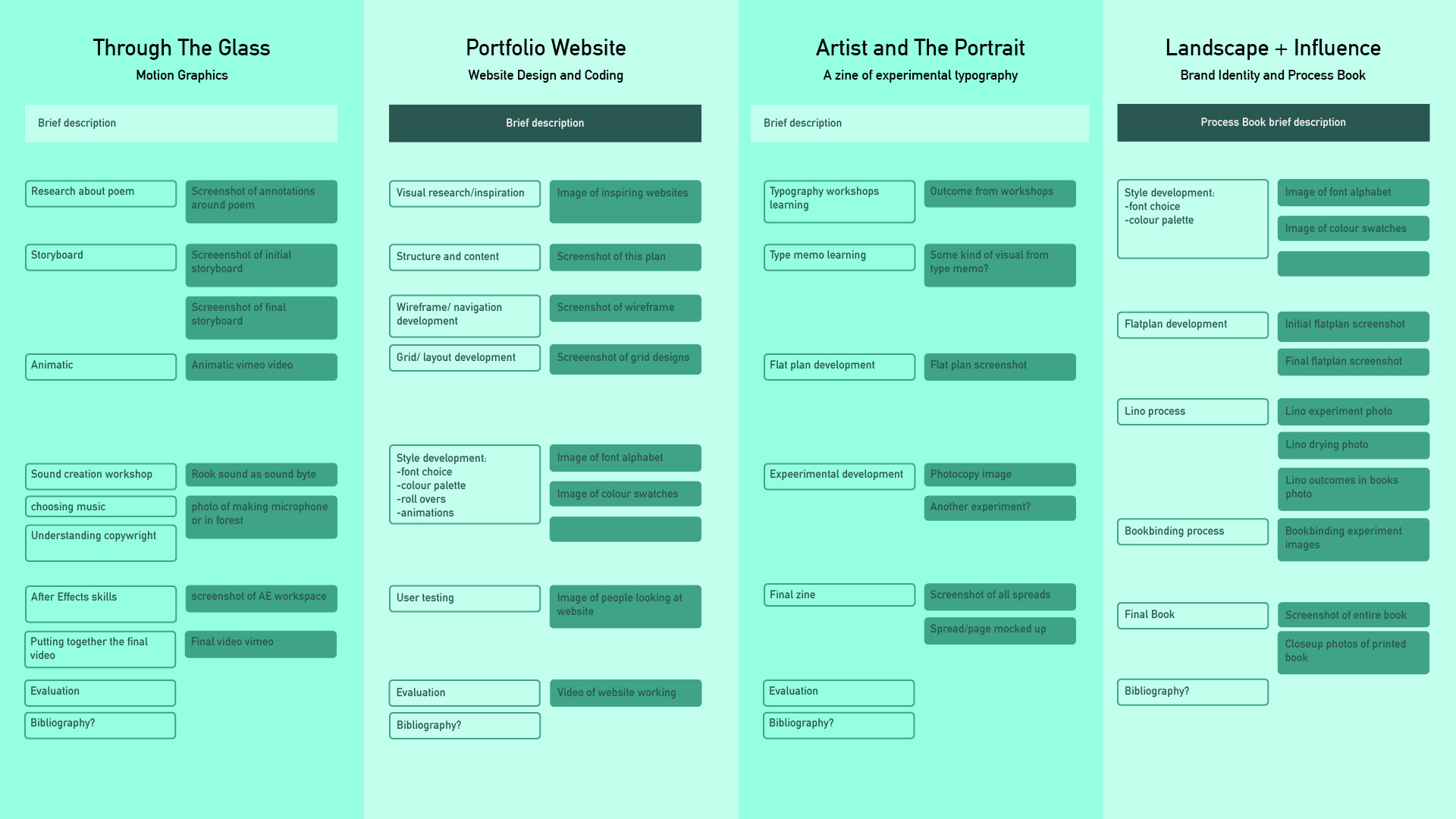
To organise the content of the web pages, I created an InDesign document with the similar page dimensions, columns and font size as the full screen website would have. This aided the visualisation of paragraph lengths and pace in the pages. Developing the content in this way was efficient and fluid, allowing me to add or restructure sections easily.
Wireframe
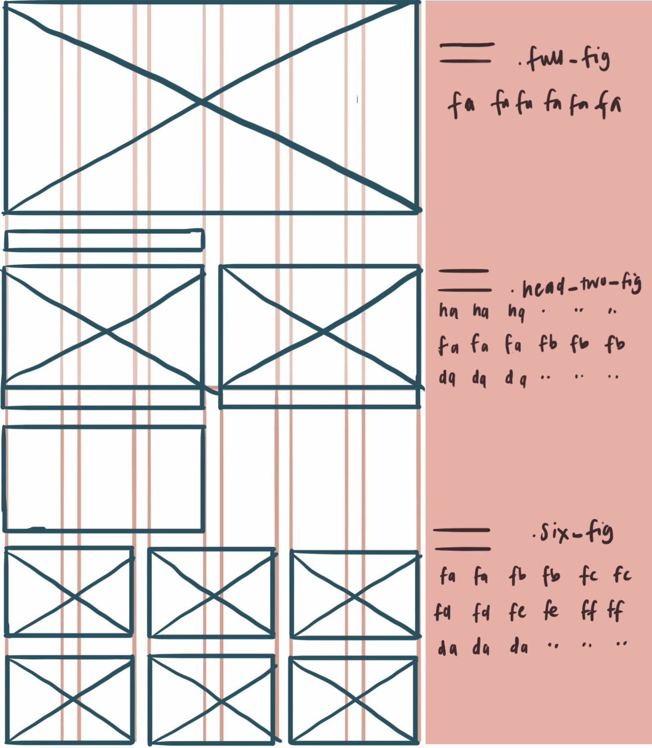
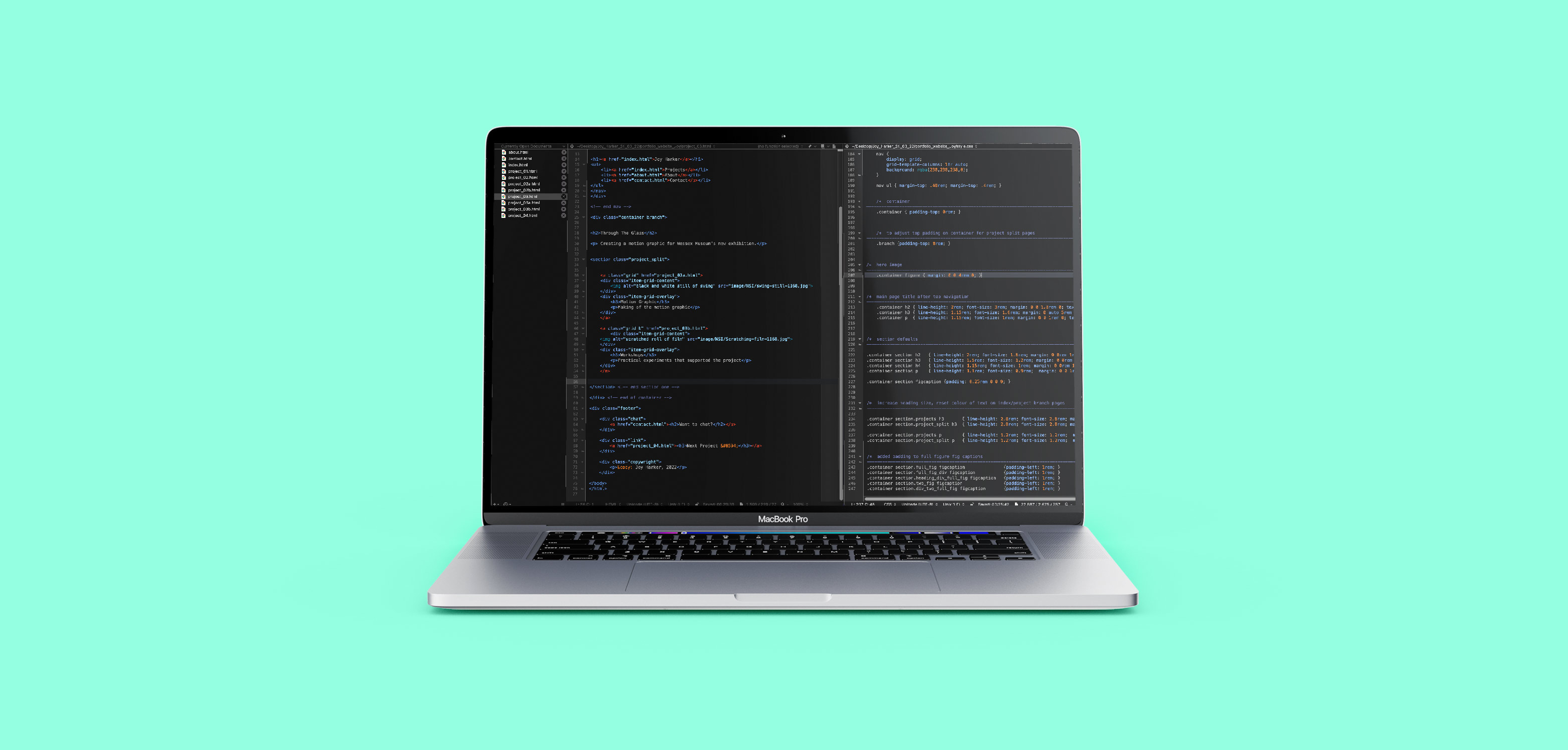
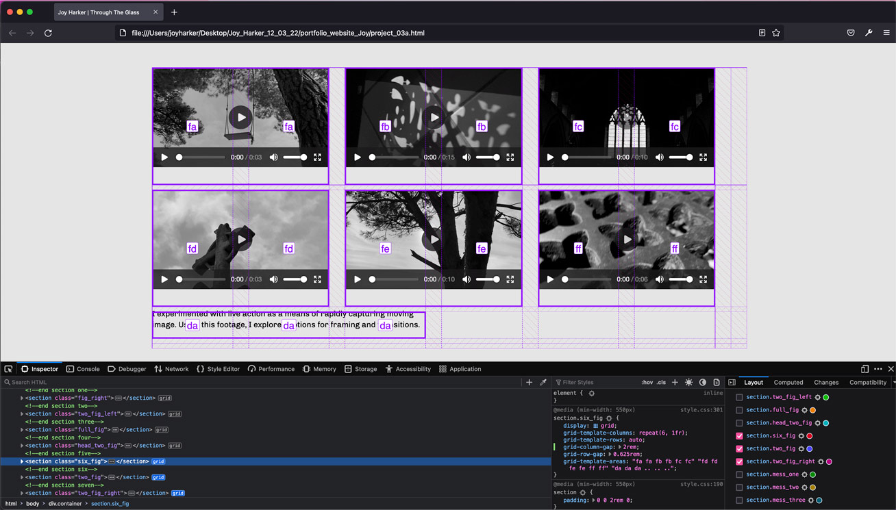
As I planned the content, I drew up wireframes for the pages, separating content to determine each section’s grid layout, I then translated these to CSS markup language so that I could quickly input this into the CSS stylesheet.
Media Optimisation
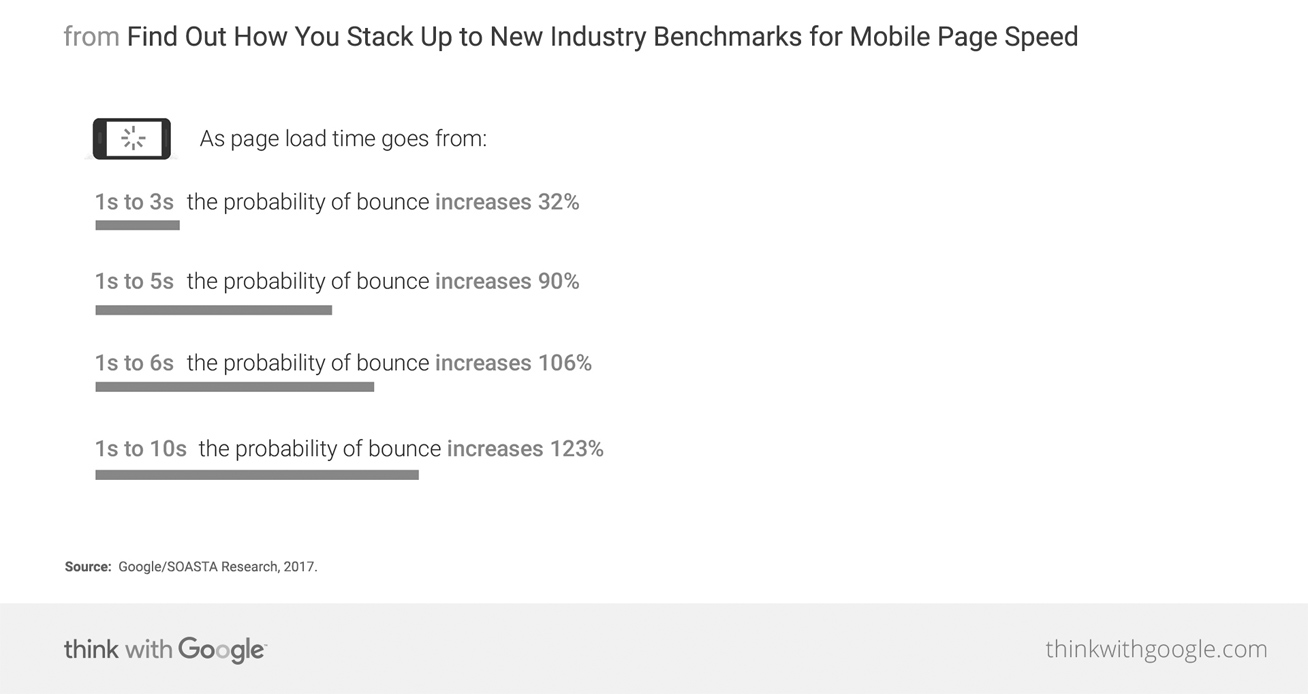
It was challenging to create a media heavy website with a fast load speed. As the info graphic shows, bounce rate dramatically increases with every second of wait time, particularly between 3 and 5 seconds. When exporting, I aimed to ensure all images would load within 3 seconds to decrease the probability of my users scrolling past key images or leaving the website altogether.
With the target users being designers, working in graphic studios, I made load time estimates based on a fast broadband speed. I used a GIF optimisation tool and exported all of the images to accurately fit their containers. Despite this, the load time for some images remained above the 3 second threshold, so I compromised by compressing some of the larger images further, allowing a low level of pixelation.
Typography
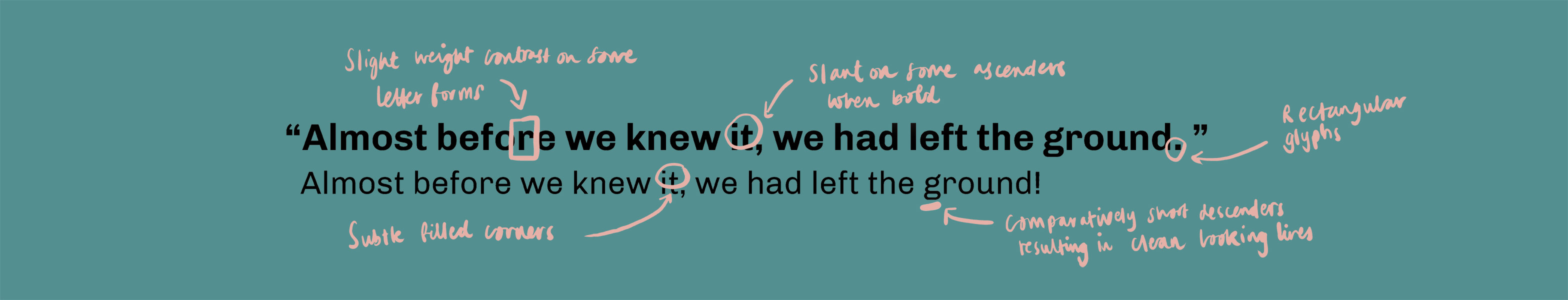
The websites I particularly liked, used clear, slightly rounded sans-serif fonts for their body text. I sampled a number of fonts within this category, and chose Chevo for its clarity and delicate details, differentiating it from more standard system fonts. I noticed that the websites’ fonts were consistent across their pages and many used the same font for their section headings and body text. I chose to do the same, differentiating headings and pull quotes by altering the font weight, size and colour.
Colour Choice

I wanted to use colour minimally on the website, accenting elements such as links and headings. Using Adobe’s colour tools, I created a vibrant complementary palette with multiple shades of each colour. This meant I could use shades to differentiate heirarchy for the headings whilst preventing an overload of clashes with the colours from the individual projects.
Learning to Code
Initially, as I was learning the languages of HTML and CSS, I struggled to understand the heirarchy of elements and conventions of the mark-up. Over the period of the project, I stripped back each element, changing the parameters to see how the styling affected the content. I used web inspector tools regularly to get an understaning of coding structures in other websites and source the route of problems in my site.
Responsive Design
To ensure optimum viewing screen sizes, I began by styling the content for a tablet screen, stacking all of the elements vertically. Using a media query, I introduced a grid format with CSS grid styling. This causes the content to reposition, spreading horizontally if the screen is wide enough.
By using relative of units of measure instead of absolute, the content is able to scale based on the user’s view port. This avoids issues such as images not filling their position on a larger screen or having to scroll through oversized images on a smaller screen.
User Testing
I asked some people to use my website, focusing on navigation, ease of use and design. This highlighted a lack of description introducing the projects, especially within the projects made up of two pages. I made changes based on this feedback.
Rollovers
To improve the user experience and create a memorable website, I experimented with roll over effects. On the home page, I overlaid the project image links with their title’s and intros. Being the first page that many users will see, I wanted it to look neat and enticing.
Outcomes
Reflection
I believe the opportunity to undertake this project will be valuable for a future career in graphic design, both through the outcomes and skills I’ve gained. By going through the stages of designing a website, I’ve gained insight into the opportunities and limitations of HTML and CSS mark-up and a deeper understanding of media optimisation, which will enable more effective collaboration with specialised web designers. Equally, I think having an individualised portfolio that I can build upon and remould with feedback will be highly valuable when reaching out to people in industry.
In terms of the content creation and styling of the site, I appreciated the brief’s openness, allowing me to design the website in a way that best displays my own work and shows personality. I found writing and structuring the content of the projects fairly difficult and time consuming, however by writing up the content in an InDesign document, I was able to quickly make edits and restructure pages.
This project has greatly widened my technical skill set. It taught me the importance of planning web design on paper before coding, using methods such as wire framing. Learning about media optimisation for web was incredibly useful, I’ve been introduced to more terminology and as a result have been able to further my understanding of media export for web. I found formatting the mark-up frustrating. I knew that there would be ways to achieve what I’d designed on paper, but I struggled to find solutions using the CSS grid method of styling. The buddy system helped with this, as I passed on and received solutions many times during the project.