Landscape + Influence: Branding
Developing a logo and identity for an upcoming Thomas Hardy exhibition for client Wessex Museums. In collaboration with Cassandra Thurlow, Gabe Roberts and Kelly Man.
Defining the Aim
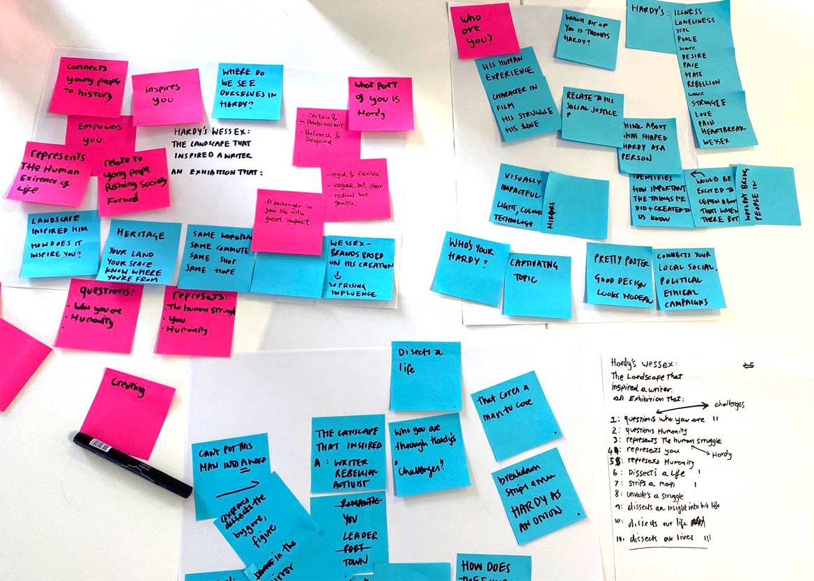
"An exhibition that peels back the layers of Hardy, exploring his relationship with the landscape.”
Experimentation

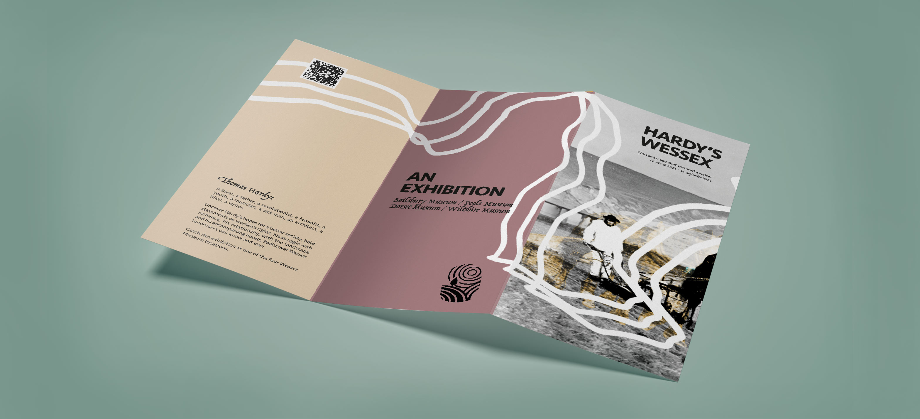
Based on the aim, I made some visual experiments using Dorset landscapes that Hardy wrote about. These developed into graphical marks in and of themselves, representing Hardy's intertwining with the Dorset landscapes.
Developing a visual style
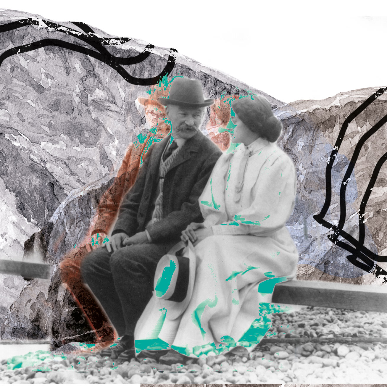
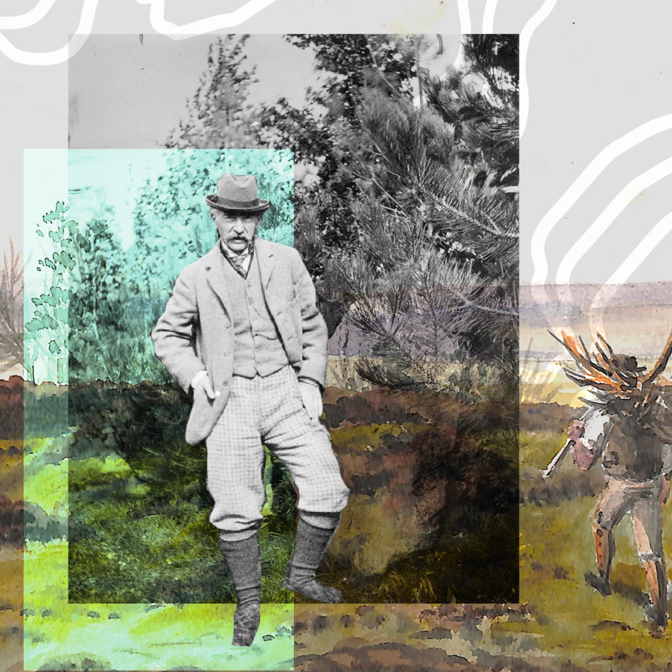
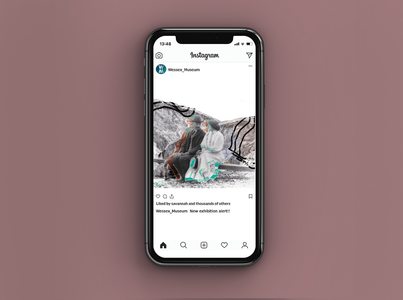
Using the visual language I was exploring, Kelly developed these collages.
Creating a logo
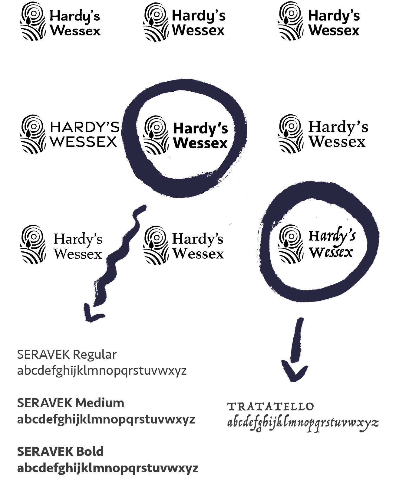
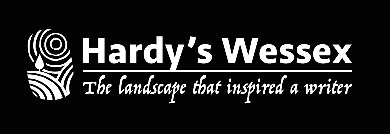
I explored a variety of fonts in combination with the logo. As a group, we chose to use a bold sans-serif, combined with the decorative serif, resembling ink handwriting.
Outcomes
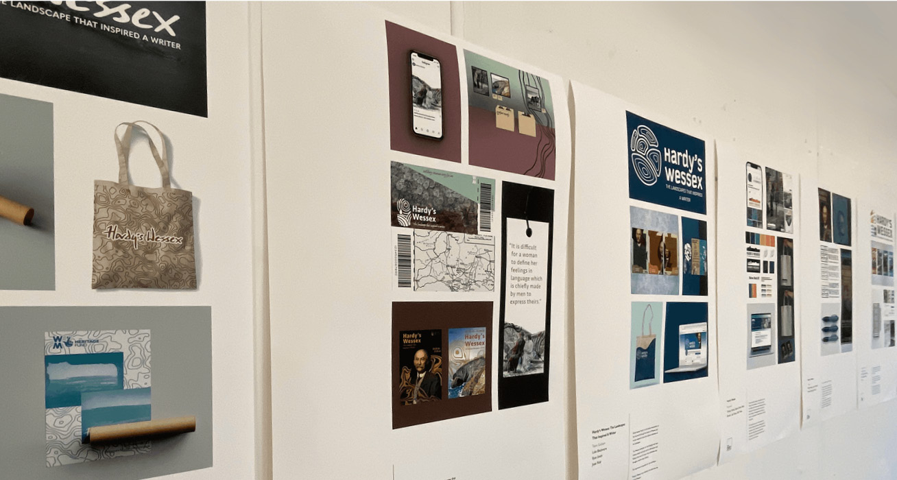
I worked on a presentation board to show our work within an exhibition space.
Final Logo
