Artist and The Portrait
The brief was to create a zine style publication based on an extract from ‘How to See the World' by Nicholas Mirzoeff using experimental techniques when designing the typography.
Digital Experiments
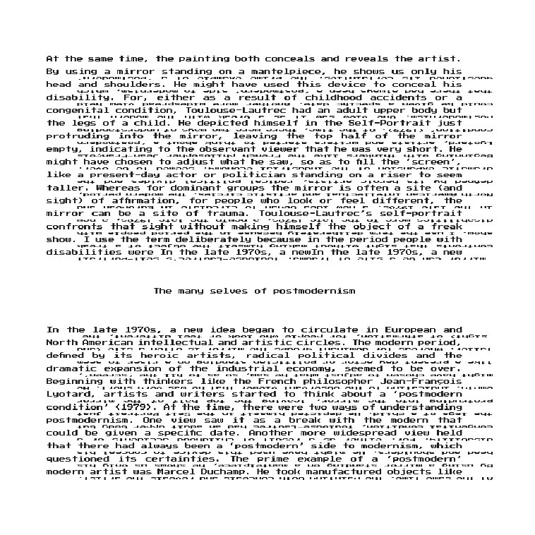
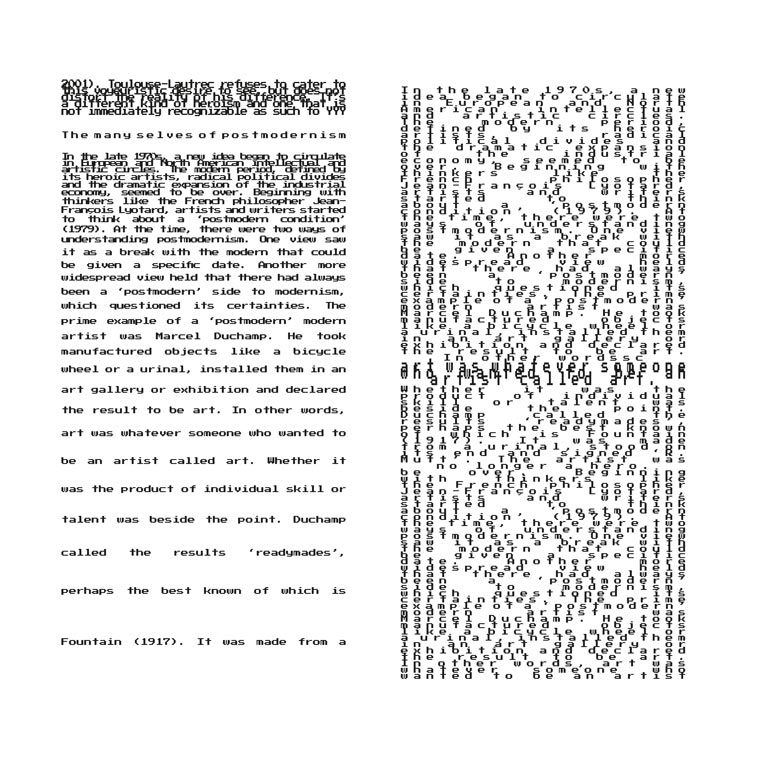
I experimented with typography through purely digital methods, using techniques such as drastically increasing the leading or line height.
Practical Experiments
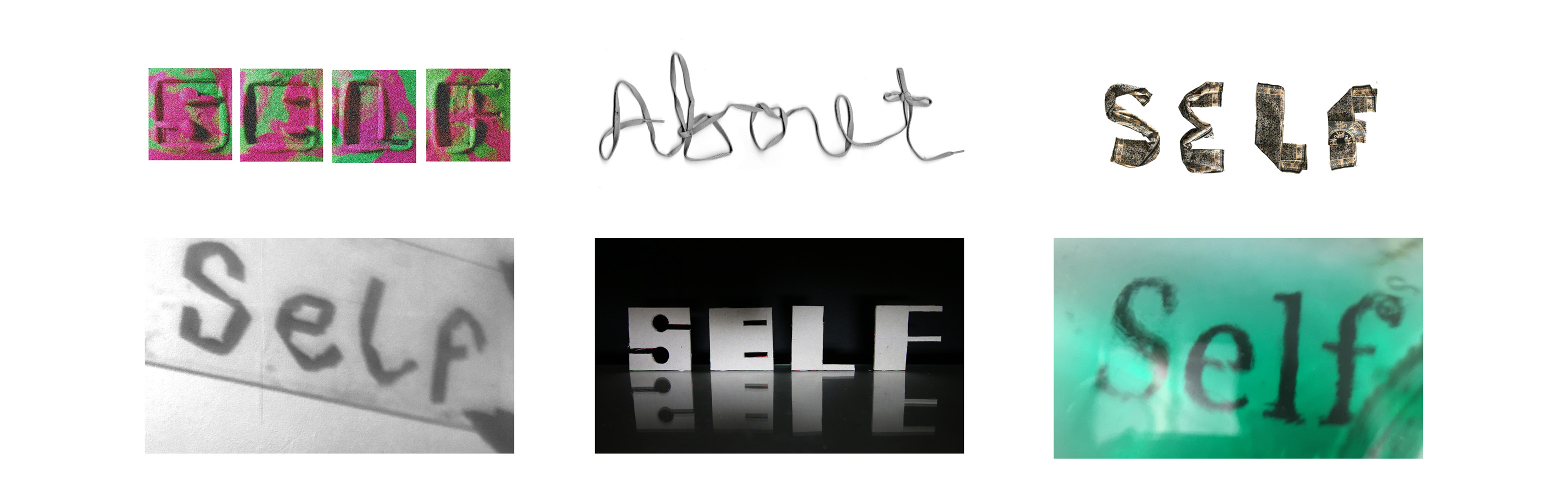
I also conducted many physical experiments using materials. I tried to explore many avenues, using materials such as playdoh and designing stamps to leave impressions. Using light and shadows of masking tape on glass, reflections, clothing and shoe laces.
Exploring the Text
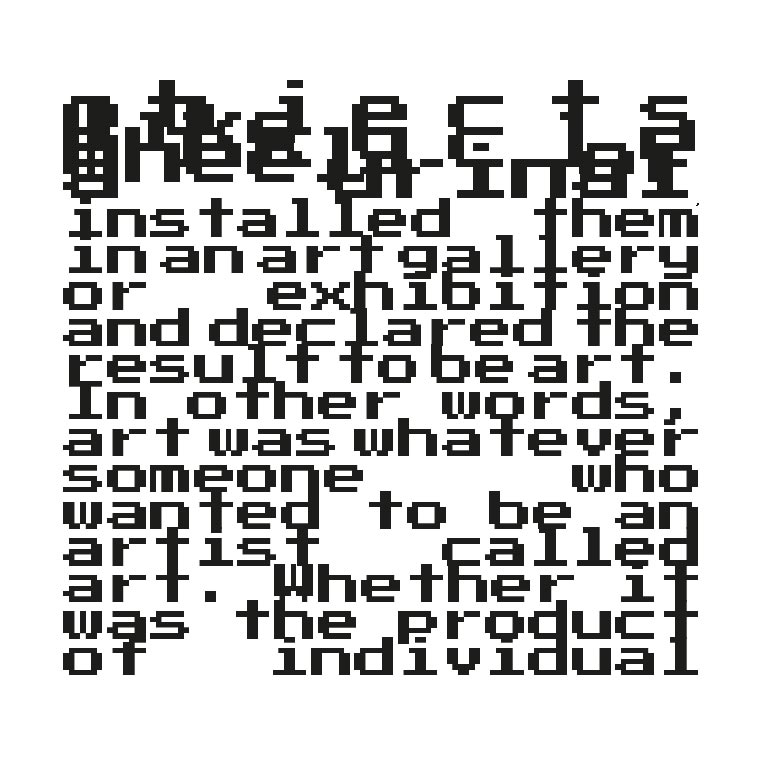
Having done some general typographic, experiments, I began delving into the text and trying to visualise anything that stood out.
Designing Spreads
I researched more into publication and magazine layouts, taking note of navigation, readability and flow. These were a first attempt at designing a spread around a section of the text.
Refining the Masthead
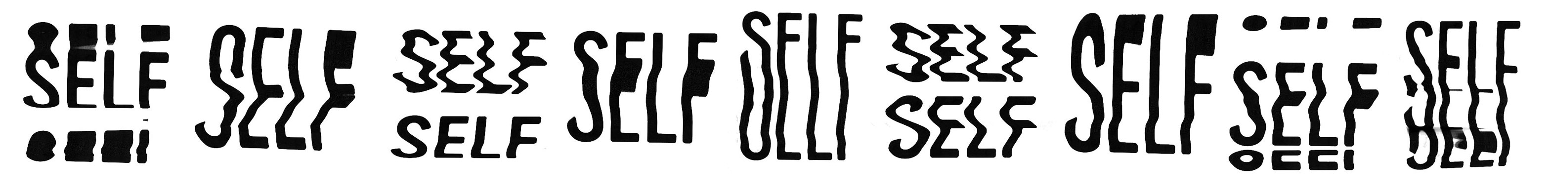
To create the masthead for the zine, I photocopied some printed type, moving it as the printer made the copies.
Outcomes